How it works
Welcome to your new workflow
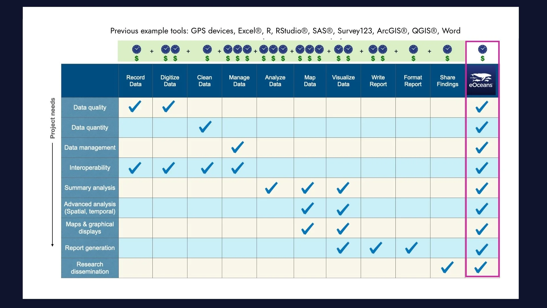
eOceans is your all-in-one system
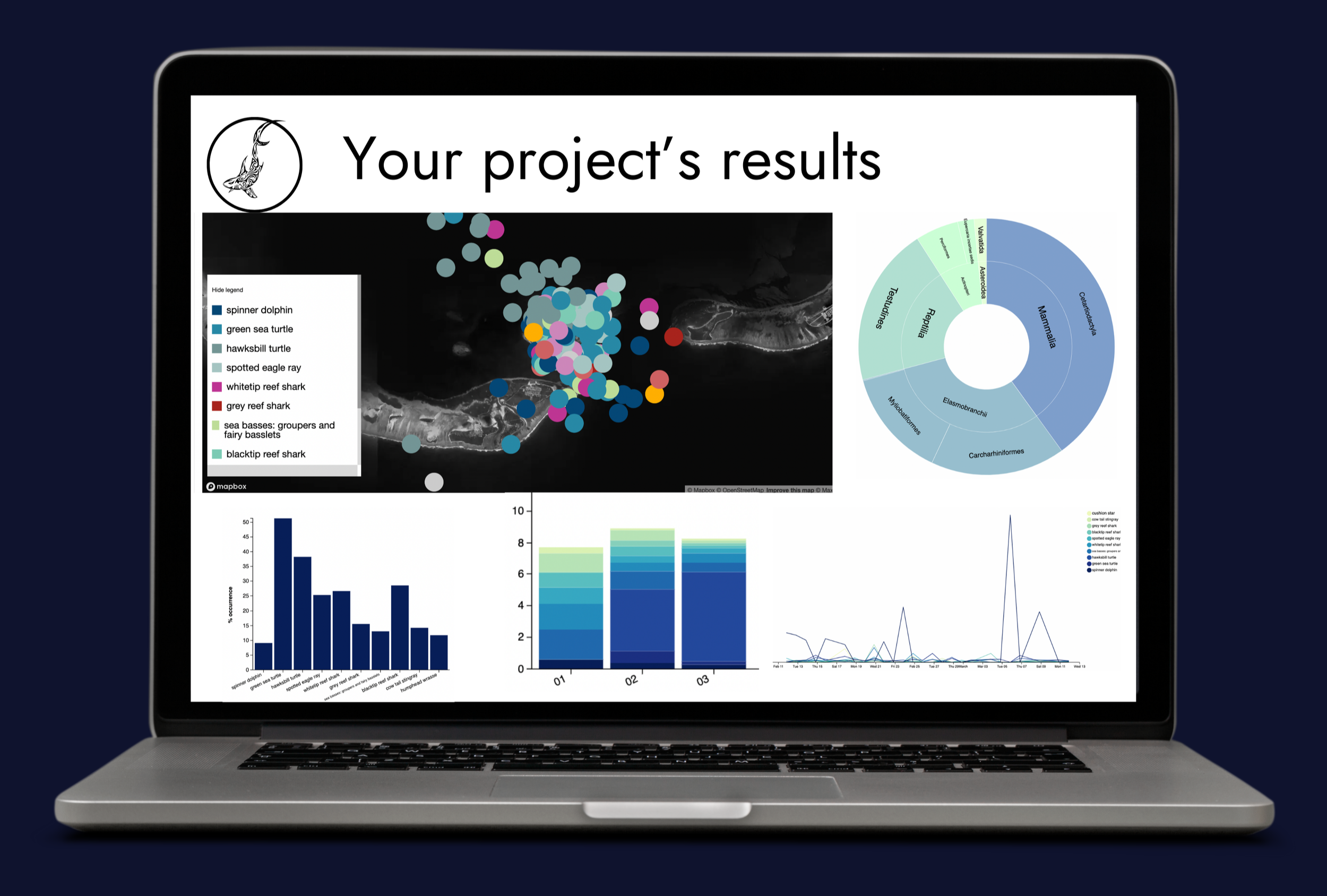
▻Collect, connect, and manage trusted, interoperable data; ▻Automatically generate expert-developed statistical analysis, maps, visualizations, and reports; ▻Describe systems — not just datasets; ▻Ask complex questions — and answer them; ▻Unlock team and budget capacity; ▻Collaborate on your terms; ▻Share results on demand.
3 steps
01. Define your project
Complete this form to configure your project in eOceans.
What you will need:
study area (geofence) defining the project’s boundaries
sampling methods — what types of data will the project accept
variables — these are the targets you are interested in, such as species, social values, threats, environment
🌀 This customizes your project to your needs, and gets you ready in minutes.
🌀 Launch the project with the subscription you need.

02. Add your trusted data
Upload your existing datasets with Magic Uploads™, stream field data from your team using the eOceans mobile app, and connect sensors through a custom API.
🌀 As data streams into the platform, eOceans goes through many invisible checks and validations. It is evaluating all the surveys and observations and automatically sends the data to any of the projects the data are suppose to go to, based on the project configurations in step 1. For example: Sharks to shark projects, longline catch data to fisheries projects. Maldives dive observations to Maldives tourism-optimization projects. Biodiversity to TNFD projects.
As the data are added to your project, they are available for human-in-the-loop validations and automated validations by the project admin or team.
The more validations the data go through, the stronger the results.
The maps, graphs, tables, and reports are continuously updated as the data come in and are validated.

03. Review results
As data flows into your project, you can quality-check it in real time and review results as they are generated.
🌀 This means you have the insights needed to inform decisions, investments, opportunities, and more.
🌀 Once you confirm the results you want to include in a report, you can discuss with team mates in the co-interpretation channel, create your discussion elements, and generate the report.
🌀 Share the report as html or pdf.